Journal Updates
As part of the Canadian Distributed Mentorship Program, here is where I will be posting my journal entries relating to the work done.
| I - | II - | III - | IV - | V - | VI - | VII - | VIII - | IX- | X- | XI- | XII- | XIII- | XIV- | XV- | XVI- | XVII- | XVIII |
Week Seventeen: August 21 - August 25
Crunch time is like peanut butter. It's gooey, it's sticky and you move through it at snail speeds. Which is my top drawer reason for having such a germanic and possibly boring entry. Well, when one spends one's whole week waiting for hour long tests to finish, only to realize that a 3 should've been a 5 and the test has to be re-run...one's outlook on "fun", "patently boring" and "caffeine addiction" takes an unfortunate turn.
On Tuesday, the abstract for the Undergrad Symposium was due. It has been uploaded in the About section of this website.
Around the same side of the theme cube, Thursday was the day of the practice presentations for the aforementioned symposium. Which gave me 4 days to run a whole bunch of tests and hope for the best. And that's where the peanut butter effect kicked in, as tests became painfully slower, and one chunk(that involved 6 averaged runs) started taking up to one hour. The presentation itself went okay, despite the fact that I had generated all the plots the night before, didn't have time to talk them over with Doina, and had a very vague idea of what they meant...
// Insert llamas here for comic relief
I have results for the algorithm. They used to be on my website, but I've since removed them.
Of interest are the following graphs:
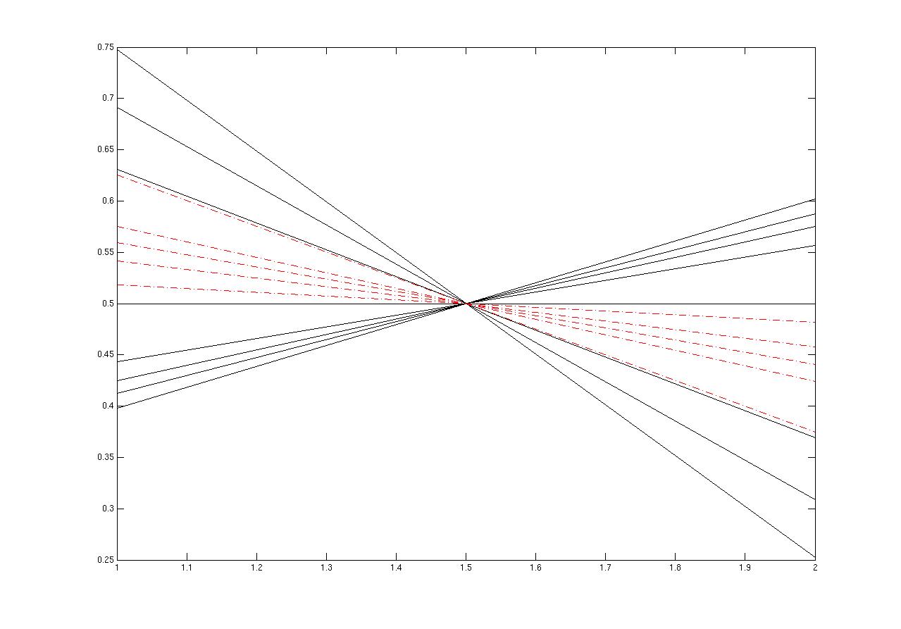
1. The state-past graph, which display how well past histories are approximated
by the states(the internal representation). The black lines are the past histories, and the red lines are
the states. One such graph is this.
Pay attention to the red lines, as they are fickle and will sneak up on you. Matlab and jpgs don't get along.
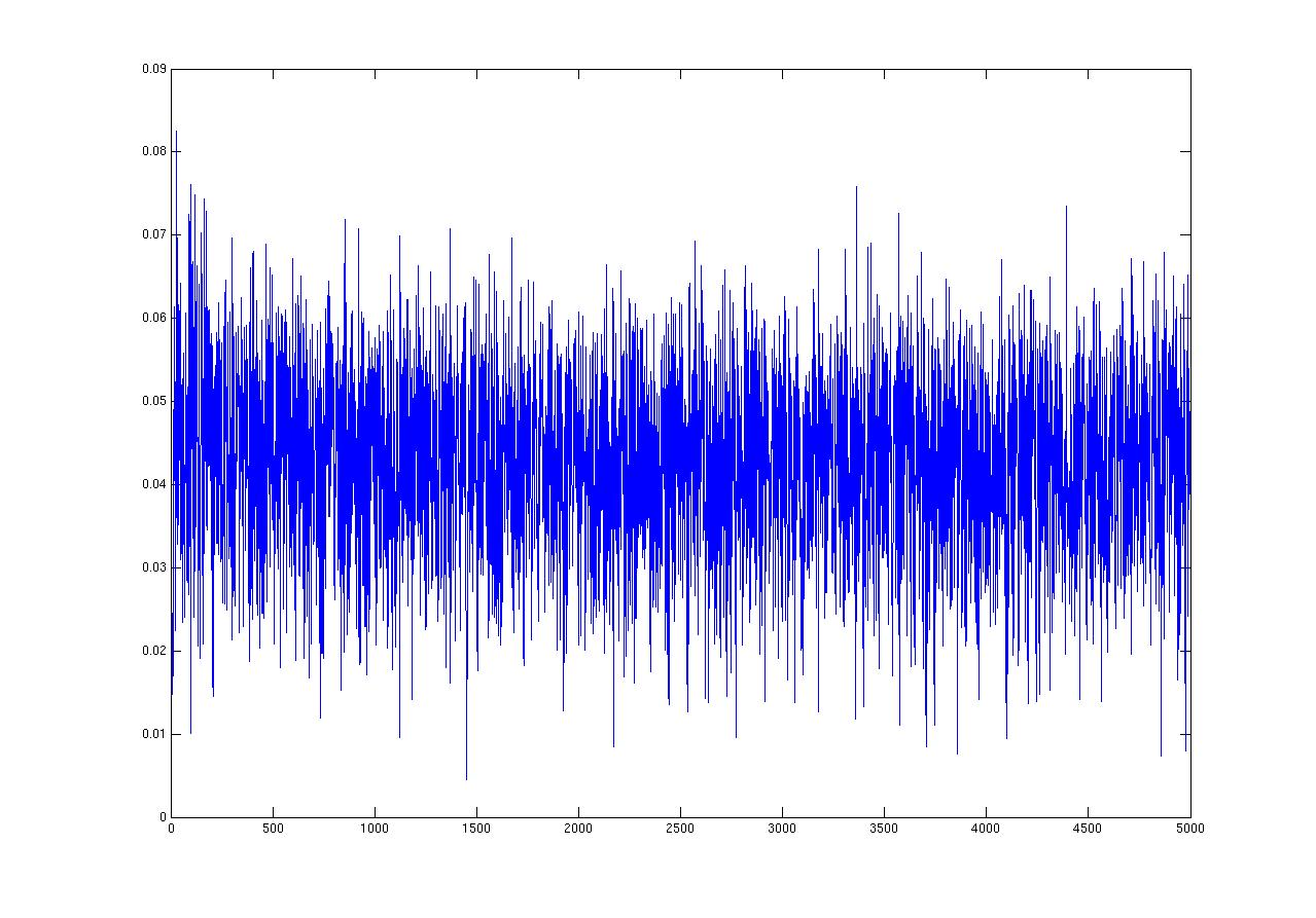
2. The value that the optimization function takes over time, which can be found
here.
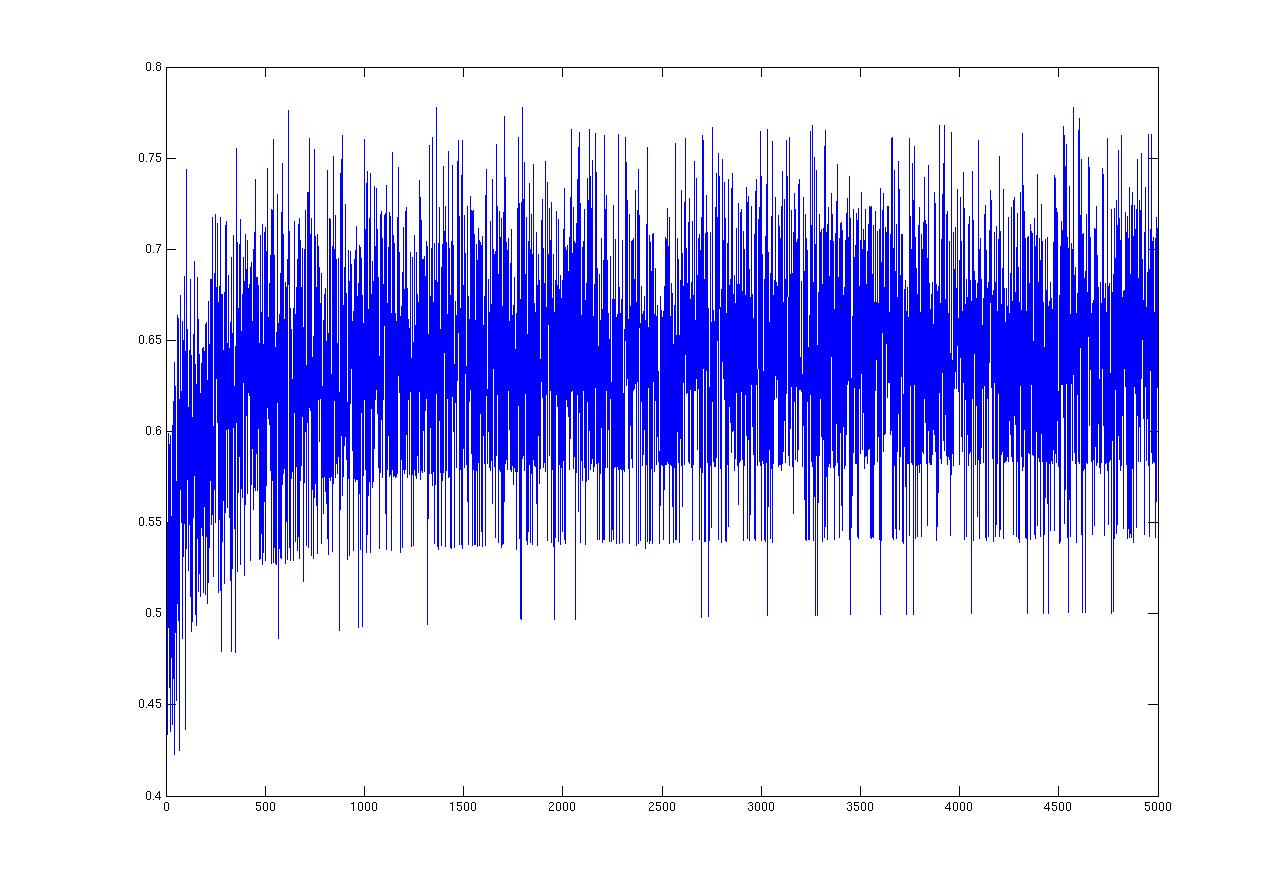
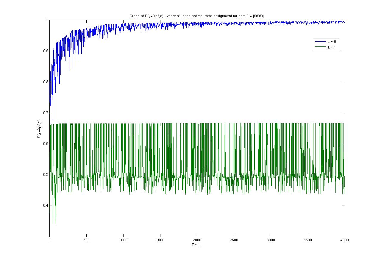
3. The graph of the probability of seing an observation given an internal state, one example which can be found
here.
This graph is particularly ugly, and is the cause of much of my grief.
In addition, we've implemented a new version of the algorithm, in which things get calculated a bit differently. For example, state-past mappings is now a function of both the internal states, and the actions taken at each time step. This algorithm looks promising because of this particular graph, which is the equivalent of the above #2. Notice how much nicer and convergent the blue plot is...
I promise much nicer plots next week. I can make this promise, because it is, in fact, "next week" as I am typing this, I've already seen the plots, and they are rather nice. I would take them out to dinner if I didn't think they would steal the spotlight.
